Introduction
Requirements
Before we dive in, I want to thank and congratulate you on purchasing one of my items. I truly appreciate your support and I'll do my best to provide you with an outstanding service.
Let's go over the minimum requirements that you will need in order to have a fully functional site using this theme running in no time.
WordPress Install
WordPress provides a fully comprehensive and in depth guide to installation on their codex site.
So instead of going over what's already been outlined there, I will simply point you in the direction of the Famous 5 Minute Install.
If you have little or no knowledge of how WordPress works please take some time to familiarize yourself with the framework.
Theme Files
After purchasing the theme, if you chose to download "All files & documentation" your theme folder should have the following files contained within it.
- Available Files
- magic.zip
- magic-child.zip
- —
- Documentation (folder with this help file)
- Licensing (folder)
- Samples (folder)
If you chose to download "Installable WordPress file only" you should have the magic.zip archive by itself, which is ready to be installed via the dashboard.
Making Custom Changes
The main package comes with a child theme (magic-child.zip) that inherits the look and functionality of the main theme. A child theme is the safest and easiest way to modify an existing theme, whether you want to make a few tiny changes or extensive changes. Instead of modifying the theme files directly, you should use a child theme.
If updates will be available (which might be important for security or functionality) and you decide to update the theme you should know your file changes are safe in the child theme. Speed up development time and be smart about it from the beginning.
The child theme must be installed after the main theme installation.
Installation
Install via Dashboard
Once you have logged into your WordPress Dashboard, navigate to Appearance > Themes. Click on the Add New button and then from the available options select upload. Navigate to where your files are stored locally and select the magic.zip file then Install Theme.
If the theme was installed successfully you should be met with notifications regarding installing plugins and activating the theme.
Do not use the main ZIP file (which contains Documentation and Samples) - use the installable magic.zip only, otherwise the whole process will fail.
Install via FTP
To install the theme via FTP you will need to unzip the theme archive (magic.zip) somewhere onto your machine. We will assume you have a working FTP program with login credentials as one is needed to install WordPress.
WordPress places it's themes within the /wp-content/themes/ folder. Navigate to this folder within your install and then place the magic folder within it. You will know this is the correct folder as the default WordPress themes (Twenty Fourteen, Twenty Thirteen) will be here as well.
Once the folder has been uploaded, in your WordPress Dashboard navigate to Appearance > Themes and activate the theme.
Install Plugins
Once the theme has been installed successfully you will be prompted to install the plugins available with the theme and some that are recommended. Click on "Install Plugins" to get started.
Cerchez Core is the required plugin that MUST be installed. While the remainder of the plugins are not required, I recommend you install them as well.
Site Setup
Demo Content (Optional)
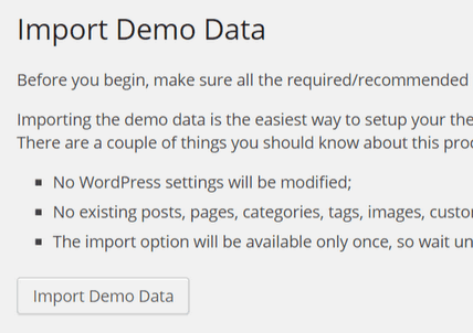
If this is your first time using WordPress I strongly recommend you import the demo content. Importing the demo content will bring in all the posts, pages, menus, widgets and theme options from the demo, into your site.
To import the demo content navigate to Appearance > Import Demo Data within your dashboard and follow the instructions.
Note: The import process requires the Cerchez Core plugin (bundled), so make sure you install and activate it first thing.
Note: If you have problems with this process please try the default WordPress import — visit the Tools > Import section and upload the content.xml WordPress file available in the Samples folder.
Page Setup
If you've installed the demo content move on to Permalinks section, otherwise let's start at Step 1.
Step 1 - Page Creation
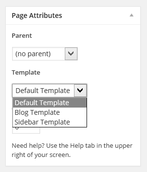
To create a page navigate to Pages within your dashboard and click Add New. Give your page a title and then set the page template (if other then the default full-width template). The following pages require special templates to be set.
- Blog - Blog Template (displays latest posts)
- Sidebar - Sidebar Template (displays a sidebar where you can add custom widgets)
Step 2 - Reading
We now need to change the homepage of the site to whatever page you like. Navigate to Settings > Reading in your dashboard.
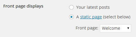
Change the Front Page Displays setting to A static page and set your desired Front page.
Menu Setup
To setup your menu navigate to Appearance > Menus. If you've installed the demo content, a menu should be available to select from. If not, create a new menu.

Add the pages that we created previously into the menu (rearrange if needed) and then under the Menu Settings tick Main Menu location.

Once that's done hit Save Menu
Permalinks
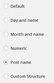
If you want to change the way your pages and posts are visible in the URL address bar you will need to change your permalinks.
Navigate to Settings > Permalinks and select your "Common Settings" option. Typically the most common selection is "Post Name", but feel free to select any of the options available. Click Save Changes and test that your site is still up and running.
If you experience 404 errors at any time while using your site, you should come back here and re-save your permalinks.
After your settings have been updated your page and post URLs should reflect the changes made.
Theme Options
Upon activating the theme, you may have noticed a new page within the theme dashboard called "Theme Options". Lets navigate to this page and have a look at the available options.
General Options
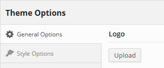
The first tab gives you the options to set your company logo, which can be uploaded via the Media Library.
Style Options
You have some options to determine the style of the theme, fonts and add custom CSS in a really quick way. A quick option is having the possibility to use over 600 unique Google Fonts for the body text and main headers without using an external plugin.
The Custom CSS field can be used to quickly customize the style of the theme and can override the default theme's style or add additional fonts, colors, spacing properties, etc. This is useful for simple customization tasks, if you don't want to create a separate child theme.
The theme contains only some basic options. If you like to style other parts of the theme you are welcome to do so using the Custom CSS field or by using a child theme. It is NOT recommended to modify the theme's stylesheet file directly.
Other Options
The theme includes some extra options for setting menu style, footer text, search icon in header, enable/disable features like the scroll to top button.
There is also the option to display a sharing widget for posts — use it to drive additional traffic to your website.
Backup Options
All the settings available in the Theme Options panel can be backed up, restored or copied to another domain.
The backup and restore feature can be useful when experimenting with the options, but would like to keep a stable version just in case.
The transfer feature is useful when moving the site to another domain and helps you migrate without the need to configure the options again.
In case of a theme update (manual or automatic), the options are preserved so you don't have to worry about losing your preferences.
Shortcodes & Widgets
Shortcodes
The theme contains a set of shortcodes to help you edit your post content more easily. They can be added manually in any shortcode based content area (for eg. the Text Widget). More conveniently, you can add them with the help of the TinyMCE button [ ] directly in the Visual Editor of any post/page.

Below is a list of available shortcodes, with a short example and atrributes (if any) for each one of them.
-
— display an accordion container
[accordion collapse="true"]...[/accordion]
- collapse — determines if the accordion has only one accordion item visible at a time (default: true)
-
— display an accordion item (must be placed inside an accordion container)
[accordion collapse="true"]
[accordion-item title="..."]...[/accordion-item]
[accordion-item title="..." opened="true"]...[/accordion-item]
[/accordion]
- title — set the title of the accordion item
- opened — determine if the item is opened in initial state (default: false)
-
— display an alert box
[alert type="success"]Alert text...[/alert]
- type — info, success, notice, error (default: info)
-
— display an audio player
[audio src="sample.mp3"]
- src, mp3, ogg, wav — source files (for HTML5 playback provide at least an mp3 and ogg file, otherwise the Flash player will be loaded)
- loop — determines if the audio player will loop the file (default: false)
- autoplay — determines if the audio player will autoplay the file (default: false) — iOS devices will require user mandatory interaction to play a file
- preload — determines if the audio player preloads the file (default: true)
-
— display text inside a box with a border
[box]Text inside the box.[/box]
-
— display a button link
[button url="package.zip"]Download[/button]
- url — link of the button
- target — none, blank — open the link in the same tab/window or in a new tab/window (default: blank)
- size — small, big (empty is normal)
- color — grey, dark (empty is the dark color)
- rel — set rel attribute
- id — set id attribute
- class — add extra class values
-
— display a call-to-action box
[call-to-action title="Hello, we are Mini!"]
<p class="no-bottom">[button url="#"]Support[/button] [button url="#" color="dark"]Contact Us[/button]</p>
[/call-to-action]
- title — text displayed as box title
-
— clears any floating elements like grids
[grid number="9"]...[/grid]
[grid number="3" last="true"]...[/grid]
[clear]
-
— display a vertical visual separator
[divider]
-
— create custom layouts by arranging elements into grids (columns)
[grid number="9"]Main Column[/grid]
[grid number="3" last="true"]Sidebar Column[/grid]
- number — 1, 2, ..., 12 (a row is divided in a 12-column grid system - 6 means half the content area)
- last — it's mandatory to mark the last grid in the row (default: false)
- class — add extra class values to the gird container
-
— adds a highlight effect to any text inside it
This is a [highlight]sample[/highlight] text.
-
— display the latest posts
[news limit="4"]
- category — retrict posts belonging to a specific category (ID or slug)
- tag — retrict posts having a specific tag (ID or slug)
- limit — number of posts to show (Default: 3)
-
— display a pricing table container and columns for each plan
[pricing-table]
[grid number="6"]
[pricing-column title="Free" cost="$0"]
<ul>
	<li>Feature 1</li>
	<li>Feature 2</li>
</ul>
[button href="#" color="grey"]Read More[/button]
[/pricing-column]
[/grid]
[grid number="6" first="last"]
[pricing-column title="Premium" cost="$100" highlight="true"]
<ul>
	<li>Feature 1</li>
	<li>Feature 2</li>
</ul>
[button href="#"]Read More[/button]
[/pricing-column]
[/grid]
[/pricing-table]
- title — title of [pricing-column]
- cost — cost of [pricing-column]
- cost_after — text displayed after the cost of [pricing-column] (default: per month)
- highlight — determine if it's the higlighted [pricing-column] (default: false)
-
— display a list of your latest portfolio items
[projects category="portfolio" filters="true" lightbox_gallery="portfolio" lightbox_class="fade" lightbox_subtitles="categories"]
[projects category="portfolio" filters="true" lightbox_gallery="portfolio" lightbox_class="fade" lightbox_subtitles="categories"]
[projects showcase="true" lightbox_gallery="projects" lightbox_class="directional" lightbox_title_inside="true" lightbox_subtitles="tags"]
- category — retrict portfolio items belonging to a specific category (ID or slug)
- tag — retrict portfolio items having a specific tag (ID or slug)
- limit — number of portfolio items to show in total (Default: -1 which means all)
- per_row — number of portfolio items to show on a single line (Default: 3)
- showcase — determine if this is a showcase type of gallery (Default: false)
- filters — determine if filters are available for the gallery — this can be used in combination with the category attribute because filters are basically sub-categories of a specific category (Default: false)
- image_width — image width for the featured image of the portfolio item (Default: 900)
- image_height — image height for the featured image of the portfolio item (Default: 600)
- lightbox_class — type of thumb animation — fade, directional, switch (default: fade)
- lightbox_icon — type of icon displayed when hovered — resize-enlarge, link, play, arrow-right (default: resize-enlarge)
- lightbox_title_inside — determine if the title and subtitle are displayed inside the thumbnail or outside (default: false)
- lightbox_subtitles — empty, categories, tags — determines if subtitles are retrieved for each item; it can display the categories or the tags each posts belongs to (Default: empty)
- lightbox_gallery — determine if the lightboxes are all part of a specific gallery
- lightbox_popup — determine if the lighboxes get opened into a popup or get redirected to the their url (default: true)
- filter_all_string — string used for the All category in the filters (Default: All)
-
— makes an iframe, object or embed resize responsively
[responsive-box]<iframe src="https://www.youtube.com/embed/8YHMAzUaFE4"></iframe>[/responsive-box]
-
— display the current site title
[site-title]
-
— display a slider container used for slider items
[slider]...[/slider]
[slider style="padding-bottom: 56.25%" autoslide="true"]...[/slider]
- class — add extra class values
- style — add custom style to the slide (padding-bottom is used for the aspect ratio - eg 16:9 -> 9/16*100 or 1080/1920*100 where 1920 is the width and 1080 is the height of the images) — default: padding-bottom: 56.25%
- controls — determines if the slider next/prev controls are displayed (default: true)
- autoslide_timer — time (in miliseconds) between autoslides (default: 5000)
- autoslide_timer_trans — determines the speed (in miliseconds) of the slide animation (default: 750)
-
— display a slider item (must be placed inside a slider container)
[slider]
[slider-item]<img src="sample1.jpg" />[/slider-item]
[slider-item caption="Simple and stupid."]<img src="sample2.jpg" />[/slider-item]
[/slider]
- caption — title of a caption displayed inside (optional)
- caption_url — url for the optional caption
- caption_url_target — none, blank — open the link in the same tab/window or in a new tab/window (default: none)
-
— display a social link
[social type="twitter" url="https://twitter.com/liviucerchez" title="View my Twitter profile"]
- type — facebook, twitter, googleplus, mail, envato, pinterest, tumblr, linkedin, dribbble, instagram, skype, github, flickr, vimeo, youtube, soundcloud, location, phone
- url — social link URL
- title — tooltip text
- class — add additional class values
- target — none, blank — open the link in the same tab/window or in a new tab/window (default: blank)
-
— display a tab container used for tab items
[tabs]...[/tabs]
- id — name, number — determines the method for naming the URL for each tab (default: number)
-
— display a tab item (must be placed inside a tab container)
[tabs]
[tab title="Tab1" active="true"]...[/tab]
[tab title="Tab2"]...[/tab]
[/tabs]
- title — set title of the tab item
- active — determine if the tab is initially active (default: false)
-
— display the current year (useful for footer area)
[the-year]
Widgets
The theme contains a section in the layout where you can add blocks of information called widgets.
Widgets are viewable in Appearance > Widgets section. The Default Sidebar widgets will be displayed on every page that has a sidebar (Blog Template, Page with Widgets Template).
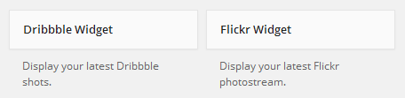
Along with the standard available widgets, the theme includes two additional ones for Dribbble and Flickr users.
If you need to create special sidebars for some of your pages then I recommand you install the Simple Page Sidebars plugin that may give you more flexibility.
Recommanded Plugins
External plugins are a great way to customize your site further. The following plugins are recommended by the theme (excluding the required Cerchez Core plugin).
- Contact Form 7 — manage multiple AJAX based contact forms
- Simple Page Sidebars — gives the ability to assign custom sidebars to individual pages
Theme support cannot be offered for external plugins (even if they are recommended). If you notice any compatibility issue please let me know — I'll investigate it and I'll let you know if it's something related to the theme.
Portfolio Setup
About Project Items
Project posts are just like regular blog posts (can be grouped in categories or marked with tags), but can be managed separately.
Create a Project Post
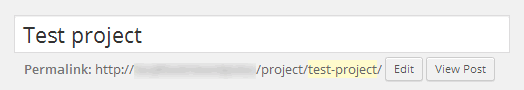
To create a new project post navigate to Projects > Add New, just like you would with a normal post. Give your project a title and adjust the permalink, if needed.
Next step is to set your Featured Image for each project — all project posts require a featured image that will be used in project galleries.
Let's go ahead and click Publish.
If you're looking for a way to change the project URL part, please take a look at the available child theme where you'll find an example in the functions.php file.
Manage Project Galleries
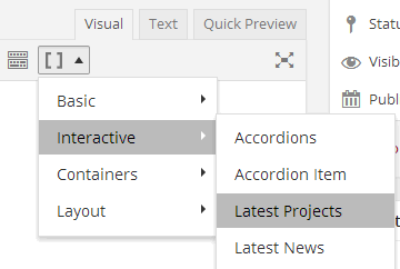
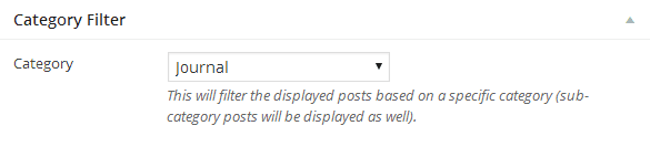
Project galleries can be displayed in any post or page using the [projects] shortcode. This can be generated using the Latest Projects menu item in the Shortcode Builder.
Every gallery can contain different project items. That's why it's recommended you group your project posts in categories and optionally mark them with tags.
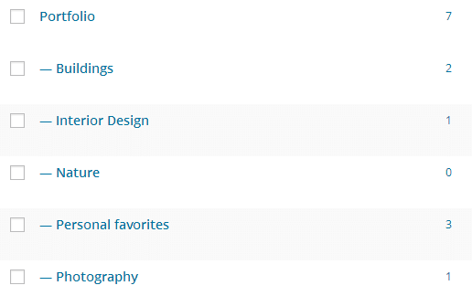
Also, sub-categories can be used for filters when displaying a gallery from a base category (Portfolio in the above image case), so take some time and group your posts accordingly.

Post/Page Settings
Post/Page Settings
When editing any post you'll notice some additional properties under the content editor.

Every post/page has the ability to display a slideshow in the header area which will override the featured image.
Blog Settings
Setting up a blog is as simple as creating a new page, selecting the Blog Template and adding new posts to your site.
You also have option to filter the posts by a specific base category (useful if you like to create different unique blog pages).
Further Info
Video Guides
FAQ
1. Missing style sheet error when installing the theme?A common issue that can occur with users new to installing WordPress themes is a "Broken theme and/or stylesheets missing" error message being displayed when trying to upload or activate the theme. This error message does not mean that the theme you have purchased is broken, it simply means it has been uploaded incorrectly. Luckily, there is a very easy fix.
2. Want to import the e-commerce sample data?The WooCommerce plugin comes bundled with dummy data which can be imported to instantly give you a working store with products to test the different features WooCommerce has to offer. Consult the official documentation for more details.
Further Support
If you have any questions that are beyond the scope of this help file, please feel free to email via my user page contact form (right sidebar, at the bottom). Don't forget to help me out by rating and leaving your feedback for the theme at: themeforest.net/downloads

Thank you and good luck with your work!